Kintana
Logo design
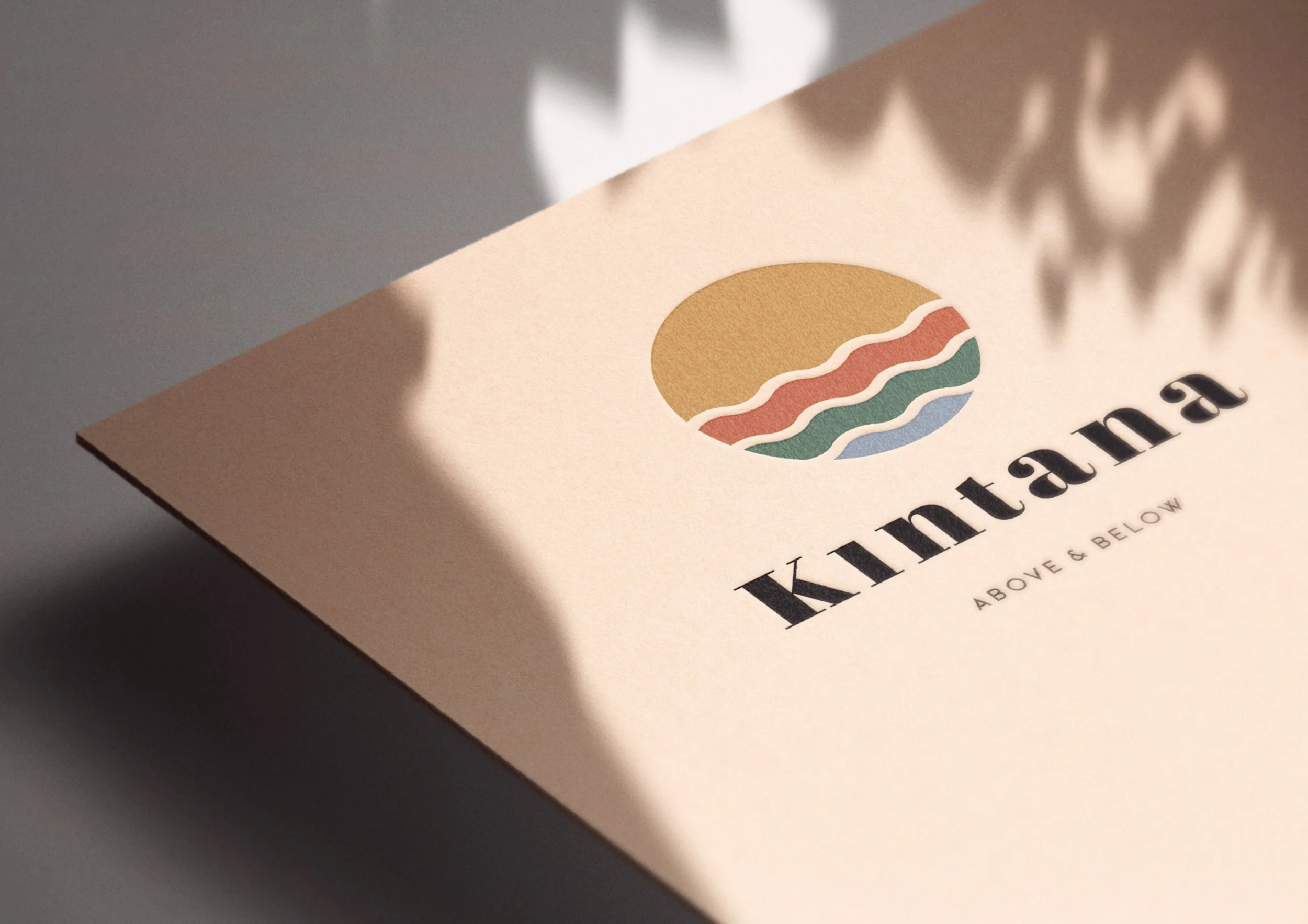
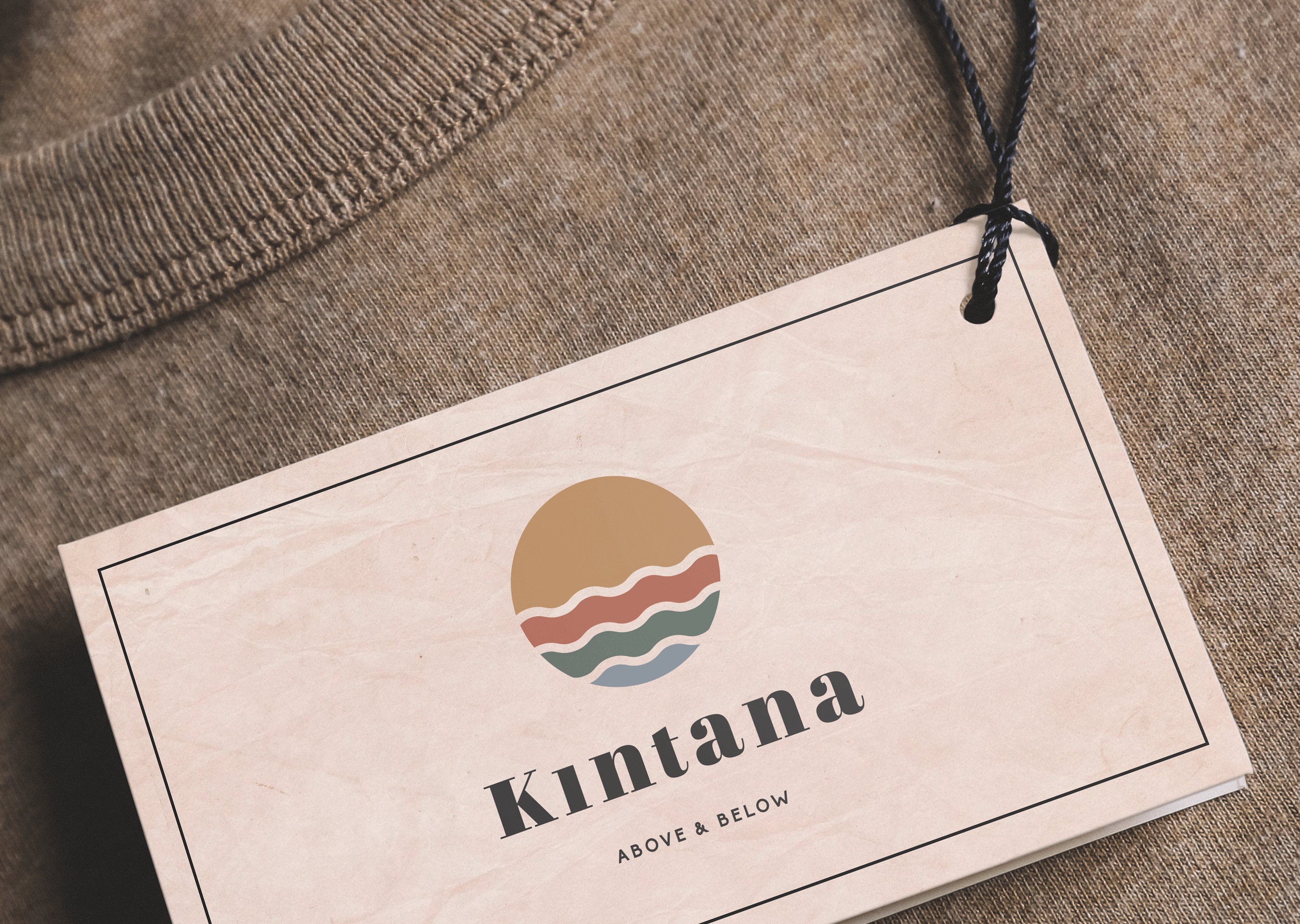
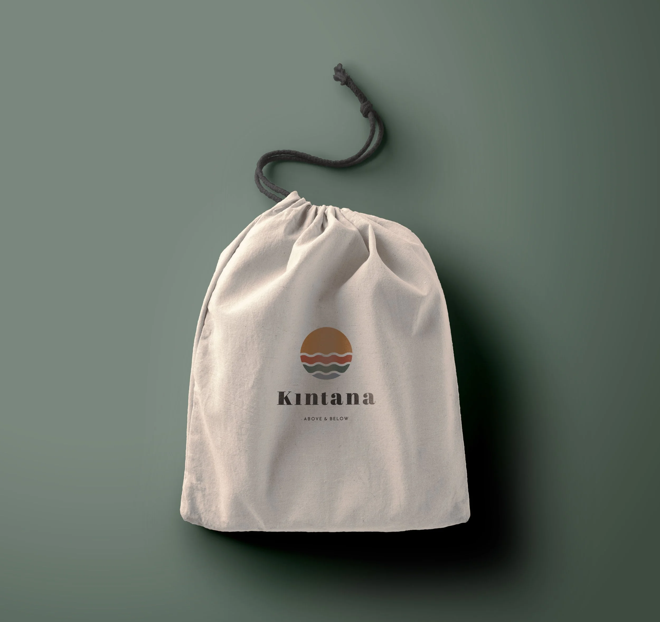
For Kintana, an outdoor wear brand, I designed a modern and simplistic logo that reflects the brand’s connection to nature and the outdoors. The logo consists of a circle divided into four parts, symbolising the key elements of sea, earth, sand, and sky—a visual representation of Kintana's dedication to adventure and the natural world.
Logo Concept: The logo is formed by smooth, curved lines within a circle, divided into four sections representing the sea, earth, sand, and sky.
Color Palette: Each section of the circle uses a distinct color—mustard yellow, burnt orange, earthy green, and deep blue—that aligns with the natural elements they represent.
Organic Aesthetic: The design incorporates organic textures to evoke a sense of authenticity and connection to nature, reflecting the brand's commitment to sustainable and outdoor-inspired fashion.
Brand Application: The logo was seamlessly integrated into various brand materials, including labels and stationery, using textures that complement the natural, earthy theme.
The Kintana logo established a strong visual identity that resonated with outdoor enthusiasts. Its simple yet evocative design—coupled with its natural color palette—helped communicate the brand’s focus on sustainability, exploration, and harmony with the environment. The integration of organic textures throughout the brand’s materials reinforced Kintana's authentic, eco-conscious approach.